Since the conception of the
Game & Watch handheld games and the
Family Computer (NES) and the birth of
Donkey Kong and
Mario, Nintendo has slowly but steadily risen to become a household name. These days it is one of the most well-known and valuable brands in the world.
For a brand of this stature, a logo is a key asset, allowing products to be recognized instantly. The brand's characteristics and values, developed and earned over the years, are carried by the brand name and embodied in the logo.
Nintendo has used the familiar "racetrack" logo (referring to the line surrounding the name) since the early 1980s, only tweaking the design ever so slightly. The typography used even dates back to the late 1960s.
But Nintendo has not always used this logo. For the first seventy-five years or so since its start in 1889, the logo consisted of the company name in kanji.
 |
| Nin - ten - dō |
These three kanji '任天堂' spell the name: 任 (Nin) 天 (ten) 堂 (dō). [For a discussion on the meaning of these characters, check out this article on
Kotaku.]
Up to this day, these kanji are used in Japan as the formal company name, and they continue to appear on Nintendo's products, although the racetrack logo is always used prominently in all marketing communication.
However, the racetrack logo was not created overnight.
During the 1950s, Nintendo first introduced a logo used mainly for its Western style playing cards: the so-called Ace of Spades logo. [More about that
here.]
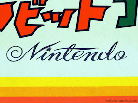
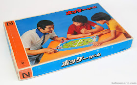
During Nintendo's modernization in the 1960s, while it also set the first small steps on the path of international distribution, it decided to introduce a logo using the roman script; readable by a Western audience and looking more modern for the Japanese home market.


